
Using ClarisWorks
The Spreadsheet Tool and Make Chart Option
Graphing Air Temperature, Dew Point Temperature, and
Relative Humidity
Here is a simple but effective way to record and organize data
for graphing. The graph will clearly show the interrelationship among
air temperature, dew point temperature, and relative humidity.
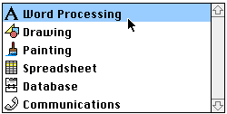
- Open ClarisWorks.
- Choose Word Processing.
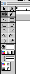
- Under View, choose Show Tools.
- Click on the cross tool. This is the
spreadsheet tool.

- Move the cursor over to the word processing
document and you will notice that the cursor changes to the
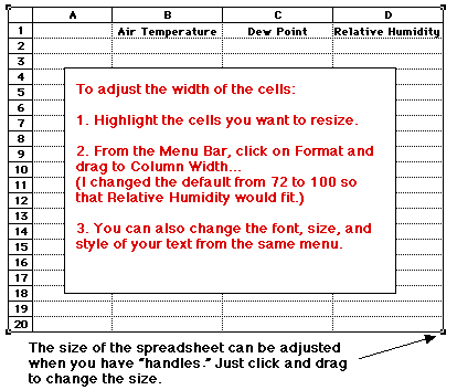
spreadsheet tool. When you click and drag diagonally you will make
a spreadsheet of the size you choose. At any time, you can adjust
the size of the spreadsheet by clicking on the cursor tool (the
arrow), and then clicking anywhere on the spreadsheet --"handles"
will appear on the spreadsheet which can be used to resize (by
clicking and dragging) or delete the spreadsheet (by pressing
delete).
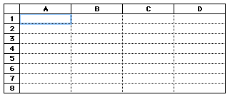
- For our purposes we will need four columns:
the first column for time, then air temperature, dew point
temperature, and one for relative humidity. To add text or numbers
to a cell in the spreadsheet, click in that cell. Type in the
information. The typing will appear in the text window under the
menu bar. When you press return it will appear in the cell.
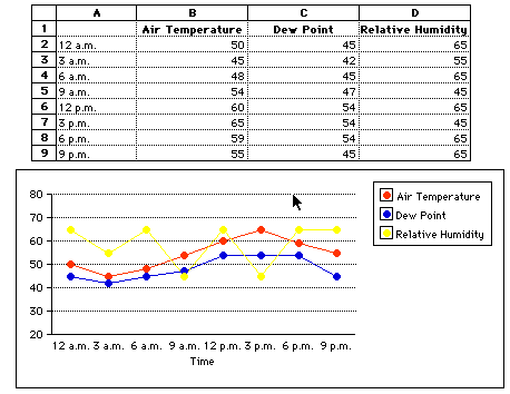
- Now add the column headings and data. Note: Do
not put the word "Time" into cell A1. What appears in cell A1
becomes the title for your graph.
- After entering the data,
highlight the information in the spreadsheet that you want
shown on the graph. Then go to Options in the menu bar and
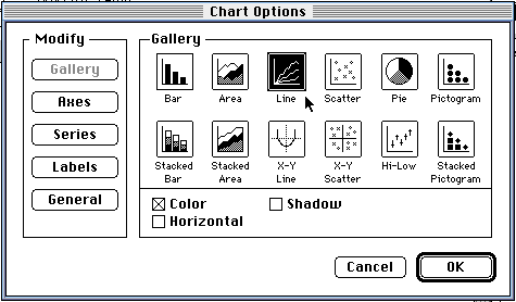
drag down to Make Chart. From the Gallery:
- choose Line graph
- DO NOT click on OK until you have followed
steps #9 and #10.
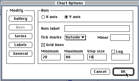
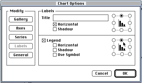
- Under Modify, click on Axes to get the
following window of options for each axis.
- The y axis is the vertical axis. You can
set the minimum and maximum number for your graph. You can also
determine the scale for these numbers by filling in the Step
size. You can also label this axis by filling in Axis
label.
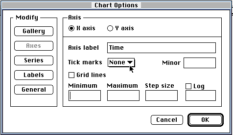
- Click on the radial button next to "x axis"
to set the horizontal axis options. See the x axis window
below. Put "Time" as the Axis label. Change the Tick marks to
none by clicking on the pull down menu and selecting "None."
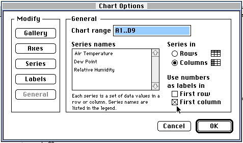
- Under Modify, click on General.
- At this window, click on the box next to
the words "First Column". This will insure that the numbers in
the first column in the spreadsheet (Time) will be used as
labels, not data.
- Now you can click on OK to see your
graph.
- The numbers in the following spreadsheet are
made up for demonstration purposes.
- By double-clicking on the graph you can get
the "Modify" window and change the "look" of your graph.
- Under Modify, click on Series. This will let
you choose the symbol for your data points. By clicking on the
orange square, you can even choose different colors.

- Under Modify, click on Labels. This is where
you can give your graph a Title. You can also modify the "look"
and placement of the legend.
- If you change the data in the spreadsheet, it
will automatically change on the graph. If you make modifications
to the look of the graph it will automatically make those changes
when you click on OK.
- If you need to add more data to the
spreadsheet, then follow these steps:
- Delete the old graph (get "handles" on the
graph and press delete).
- Add the additional data to the
spreadsheet.
- Highlight all the data in the
spreadsheet that you would like to show on the
graph.
- From the menu bar, select Options
and drag down to Make Chart.
- To set the parameters for the graph axes,
follow the same procedure as in Step #9 above.
Joanne Goodwin,
Technology Resource Teacher
Back to The Technology Resource
Page